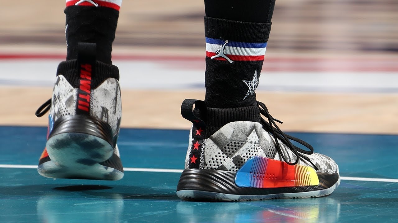
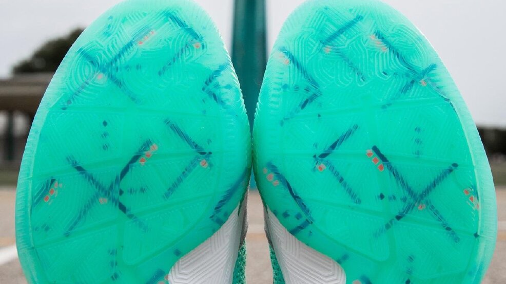
DAME EXT/PLY- Damian Lillard’s 8th Signature shoe is based on his love of music. This was the launch color way, and the first shoe to co-brand with his D.O.L.L.A. musical persona. The upper sublimation fade uses a new technique that I had been working on for some time. The team really sweated the details, from the individually painted medial eyelets, to woven tongue labels, to translucent rubber that still grips the floor. Dame’s lyrics were featured on all the shoes in this season for an added personal touch.


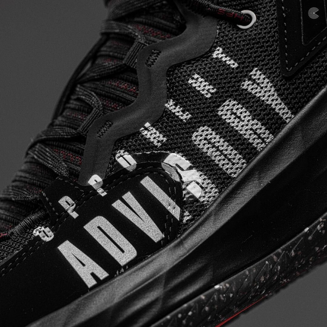
DAME EXT/PLY- This was Track 2 of The DAME EXT/PLY. Taking inspiration from Parental Advisory labels, this color way warns Dame’s opponents of how dangerous he is on-court. We wanted the label to look stamped on, after-the-fact. Finding a way to achieve that at a production level was a great challenge, and a really good feeling for the team once we figured it out across multiple media.



DAME EXT/PLY- This is a collaboration between Shaq and Dame (and adidas and Reebok). The challenge- how can we get the EXT/PLY shoe to express some of the characteristics of the Shaqnosis shoe that launched in 1995, when the design language is very different between the two shoes? I didn’t want to print on the upper, so I designed new hotmelt overlays in black, placing them in a position that the factory, when painting the midsole separately, could line them up. It worked out well.



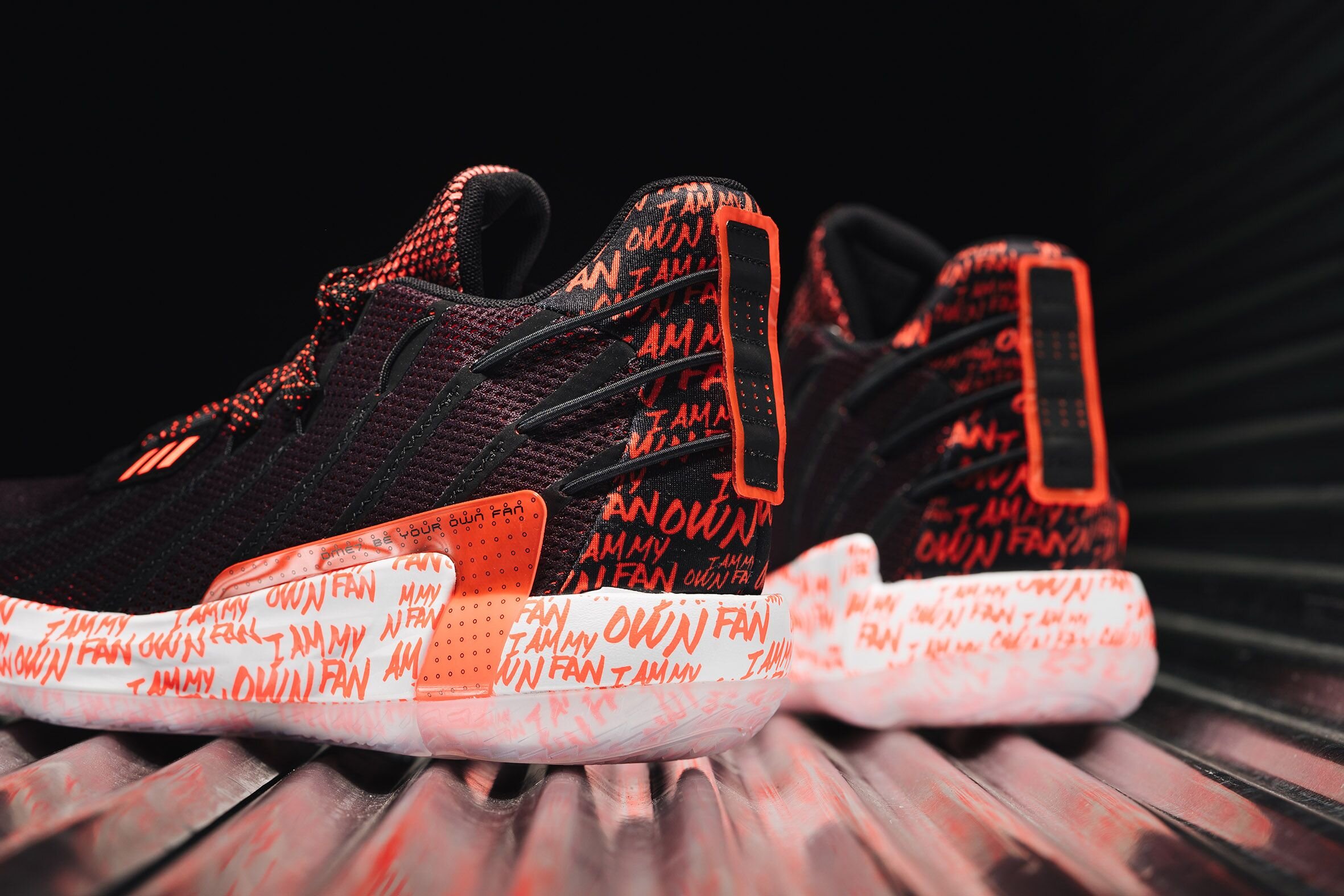
DAME 7 “Visionary”- This was a really challenging shoe to color because it was based on reading visuals beneath layers of mesh through print and color-shifting layers. The team did an amazing job, and the result was some really cool color-shifting meshes, hidden reveal words, and a new take on coloring outsoles without using color dams, as seen in the word “dame” on the outsole.


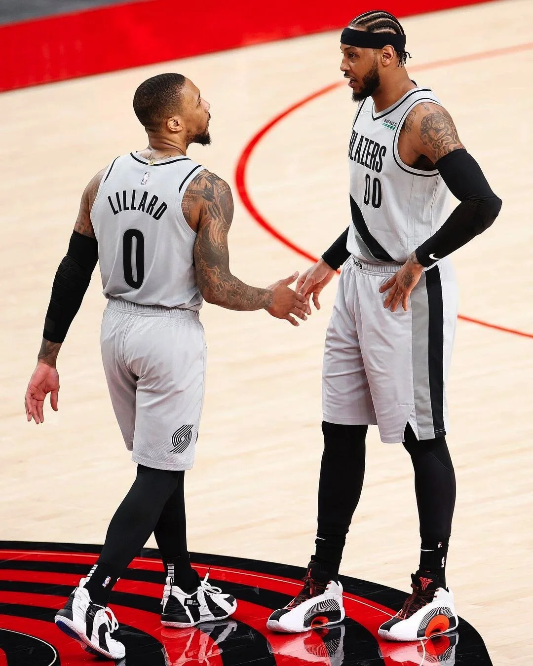
DAME 7 “Ric Flair”- This is the Ric Flair’s Dame 7 collaboration. This was extremely challenging with all the different surfaces and applications of metallics, I wound up using an assortment of print, back-painted TPU, embroidery, and vacuum sublimation to get the final look. Ric Flair gave us a “Wooooo!” when he saw them, so mission accomplished.
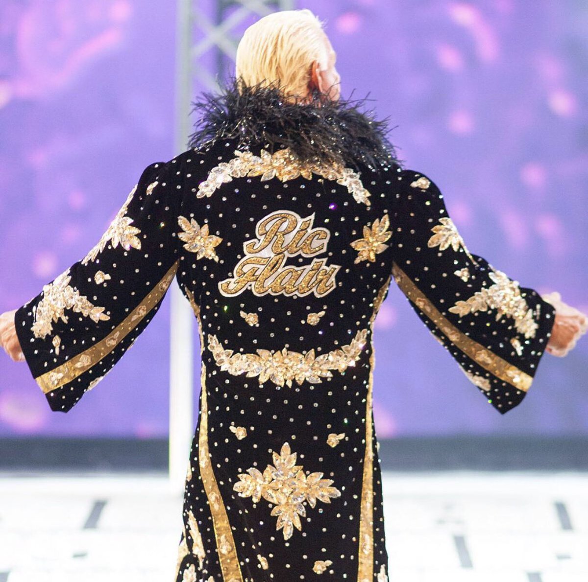


DAME 7 “IAMOF”- This was the elevated version of the Team shoe for the DAME 7, meaning that this execution wound up being reproduced in all team colors for High Schools, Colleges, etc. “I am my own fan” is a personal mantra of Damian Lillard’s, so it was important to him that we feature it prominently on the shoe. It wound up being the shoe for his avatar in NBA 2K21.




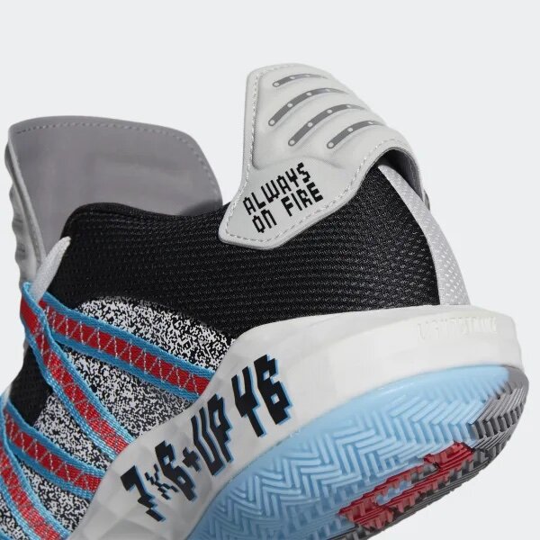
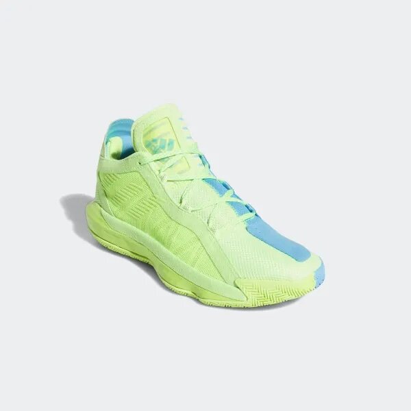
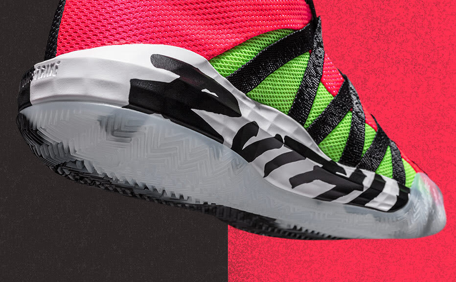
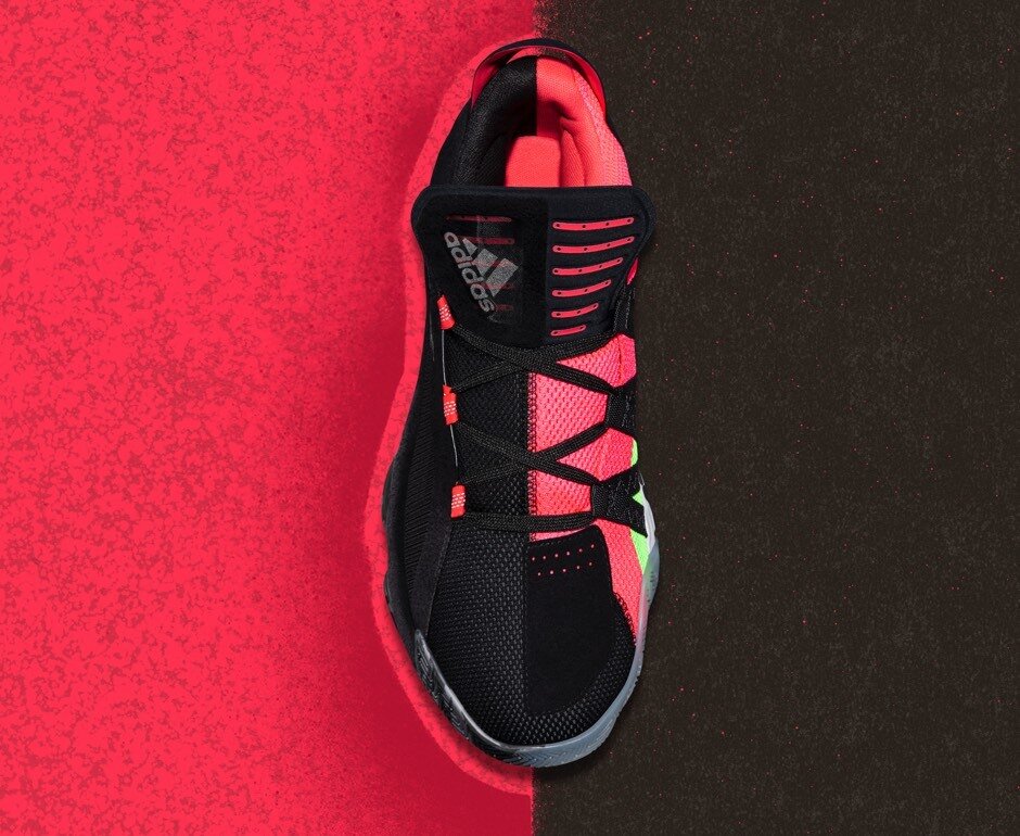
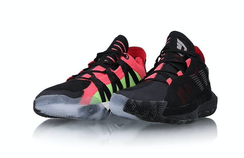
DAME 6- This shoe was based on duality, in that there are two sides to Damian Lillard. Everyone sees him as a nice respectful guy and good leader, but he’s also a tough guy and a killer on the court. In color, we treated every color way as an expression of duality- toned down and lux on one side, bright and technical on the other, as an example. This color way was the launch color, entitled Ruthless/Leader.





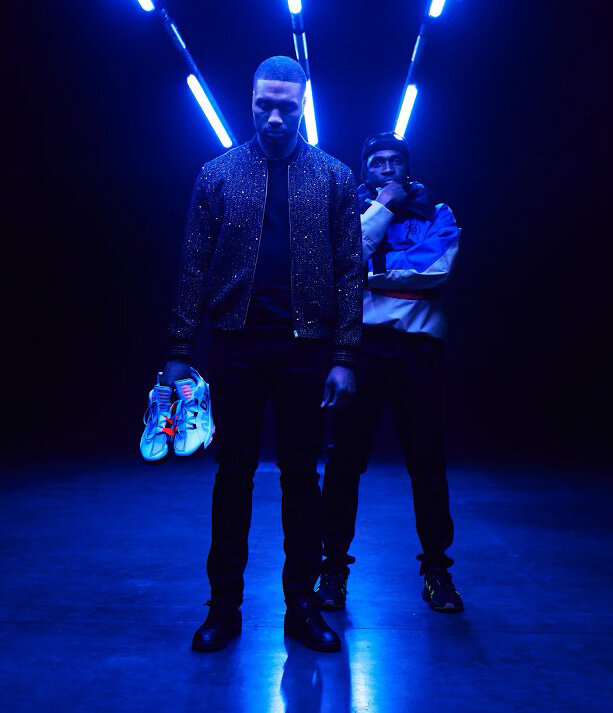
DAME 6 “ASW”- This was Dame’s All Star shoe in collaboration with Pusha T. My favorite part of this project was the crazy timeline that forced me and the Developer I was working with to get extremely creative with our execution strategy. This one will always stand out for me for the creative solutions we employed.
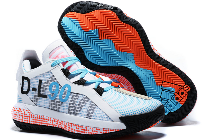



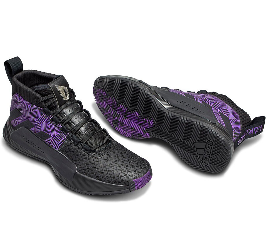
DAME 5 “Wakanda Forever”- This was a shoe I did as part of a larger Marvel Pack. Dame is a Black Panther fan, so this was an important one for him. We focused on premium executions, like the metal Dame tongue logo, and nice rubber printed textures to mimic the suit.


DAME 4- My Involvement on this DAME 4 was limited to executional help on the glow in the dark rubber and speckle paint, but I love the project because it involved such a broad team that had to come together, not just to make the shoe for footlocker, but to transform it into a roller skate, and then for Dame to have a rollerskating party for a bunch of kids in Portland. It was one of those great moments.


DAME 1- This was one of the first D Lillard shoes I ever did. All the details tie back to the Rose City. It’s still one of his favorites today, you can go see it on display at his car dealership, if you’re in town. I created the rose graphics for the shoe, and Dame always liked how the RP on the upper made it look like it was raining.


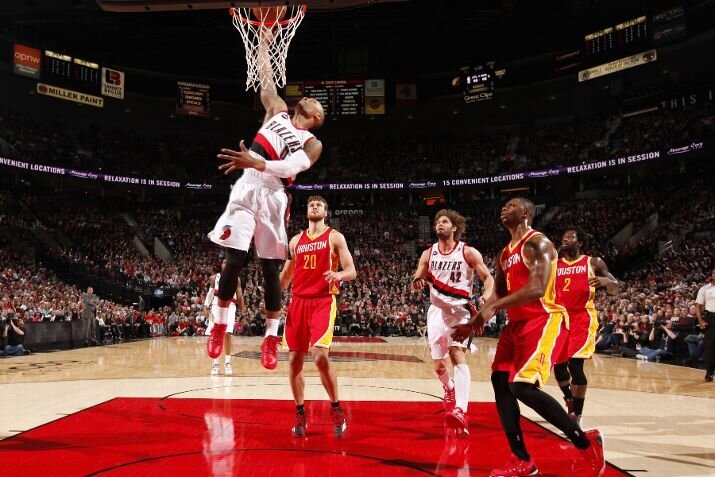
REAL DEAL “ROY”- This was Dame’s Rookie of the Year Real Deal. It was the first time I got to sit down with an athlete one-on-one and talk through all the details, which are jam-packed onto this shoe. Micah Kassell and RobO Macallum did all the graphics, and there are a ton hidden inside and out. This was also the first time Dame told me that his number 0 was actually the letter “O” (they weren’t calling him that yet), so I made the heel logo red, purple, and black for Oregon, Ogden, and Oakland- the first time, not the last, that that story has been told on his product.


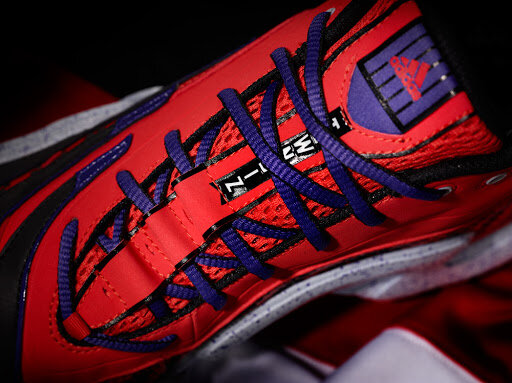
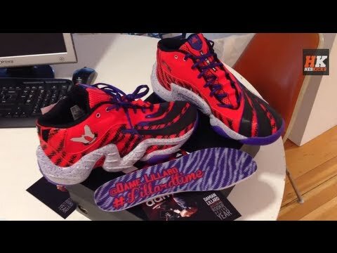
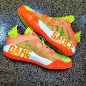
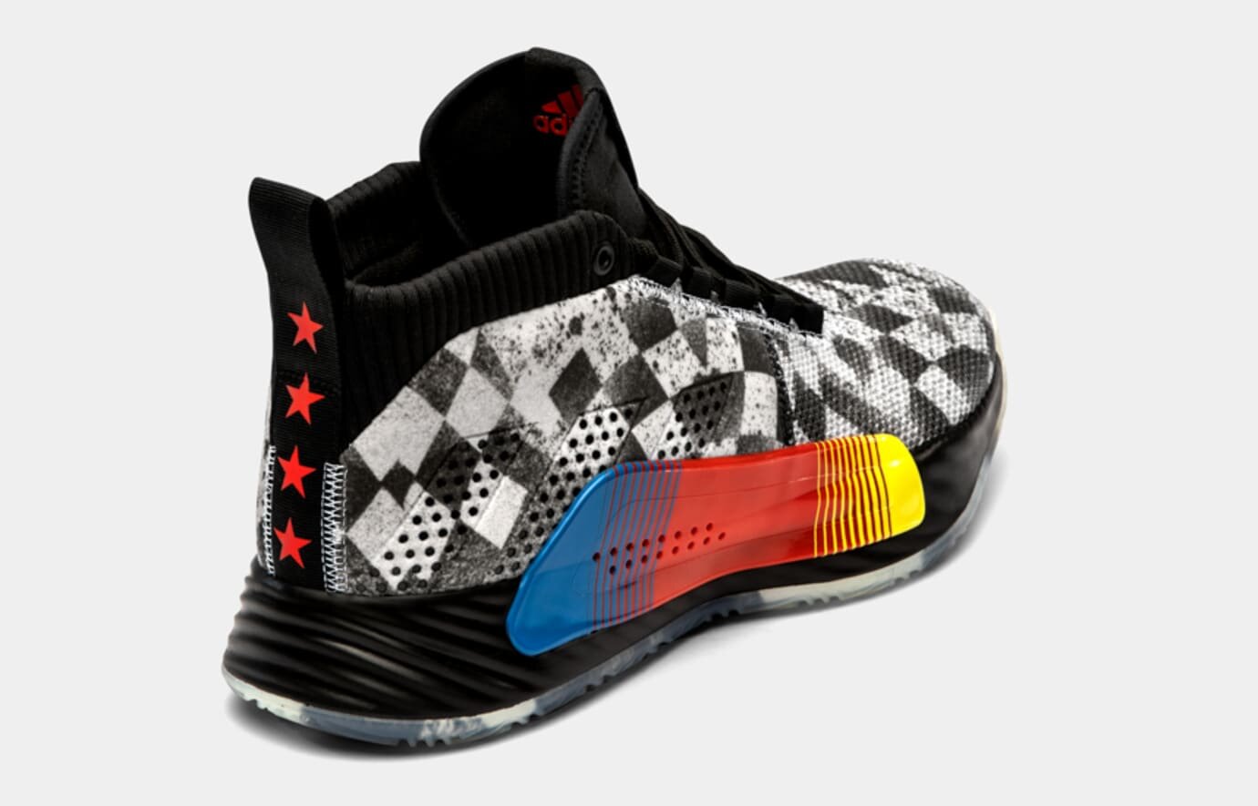
Here are just a few more fun Dame projects I have been a part of over the years. All of these were very quick-turn projects and the quality of the graphics and details speak to the great Design and Development teams I’ve worked with.


